PROJECT details
Project Type: Logo/Branding Creation & Event Materials (Banner, Trifold, Tabletop Flyer Design)
Company: Bethlehem Progressive Baptist Church
Date: 05/2026
Role: Graphic Designer
Project Duration: 2-3 Weeks
Intended Use: Branding applied across various marketing and print materials created to promote the church’s history, support community outreach during the event, and attract new congregation members.
PROJECT OVERVIEW
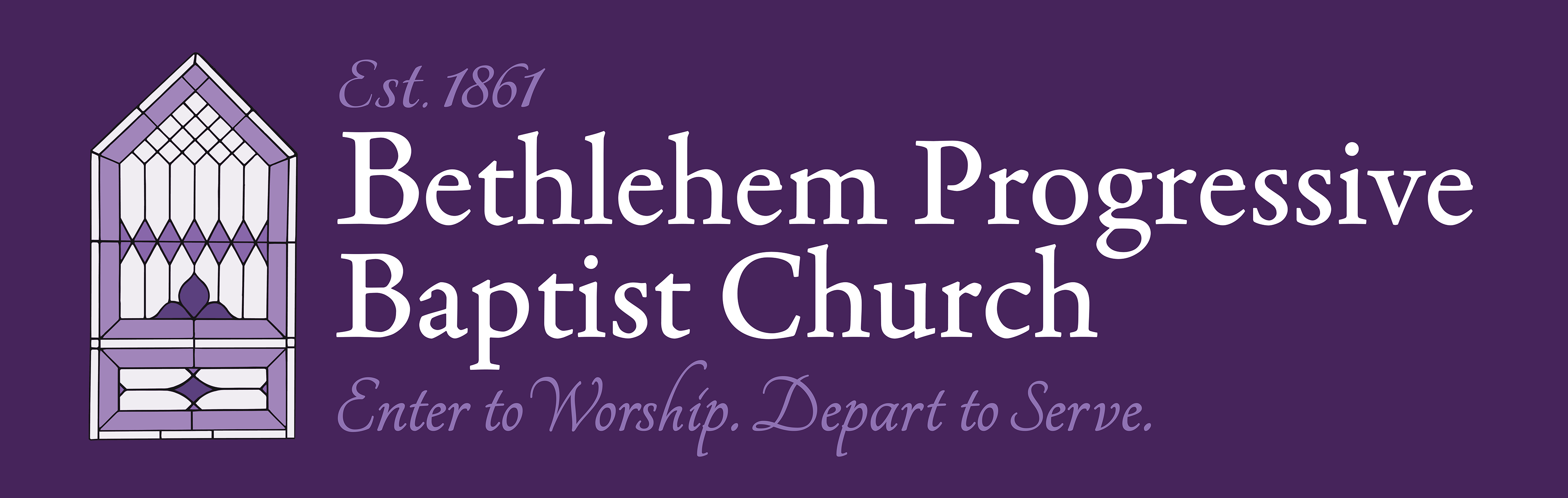
The following project was a full branding and marketing campaign created for a local church in preparation for an upcoming Emancipation Day event. Because the church had little to no existing branding despite its long history, I developed a visual identity system inspired by the church’s architecture, atmosphere, and mission.
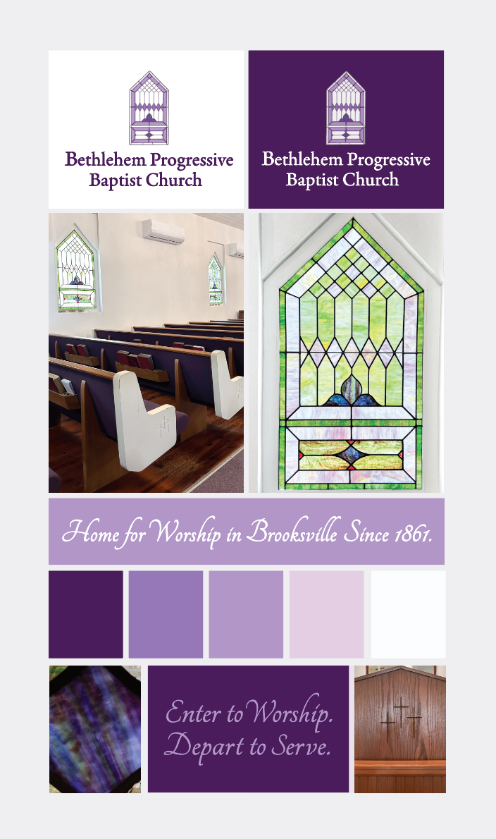
The branding drew heavily from the church itself — stained glass elements were inspired by the real windows throughout the building, while the logo silhouette was modeled after the church exterior. The purple color palette was influenced by the pews and interior details, helping create a warm and recognizable identity.
Typography was used to balance the church’s historical roots with a more modern presentation. Classic serif and script typefaces emphasized tradition and elegance, while bold and minimal typography combinations introduced a cleaner, contemporary feel.
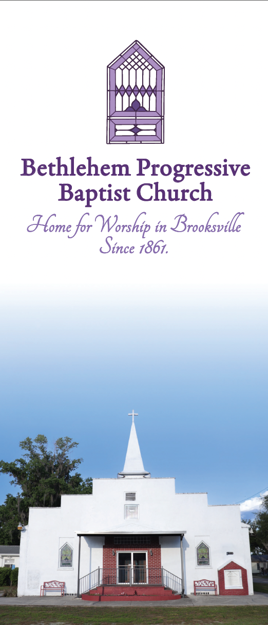
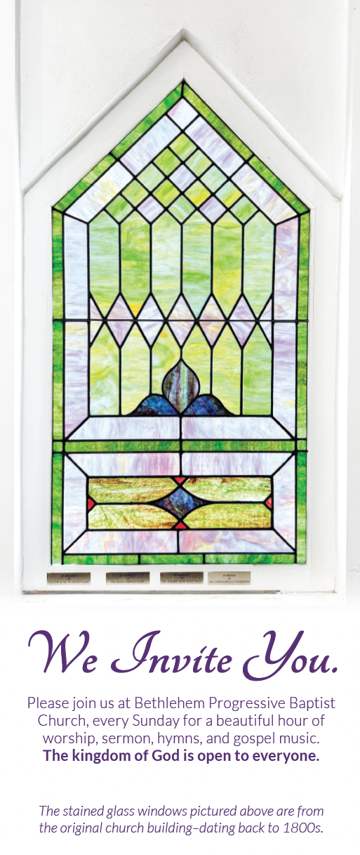
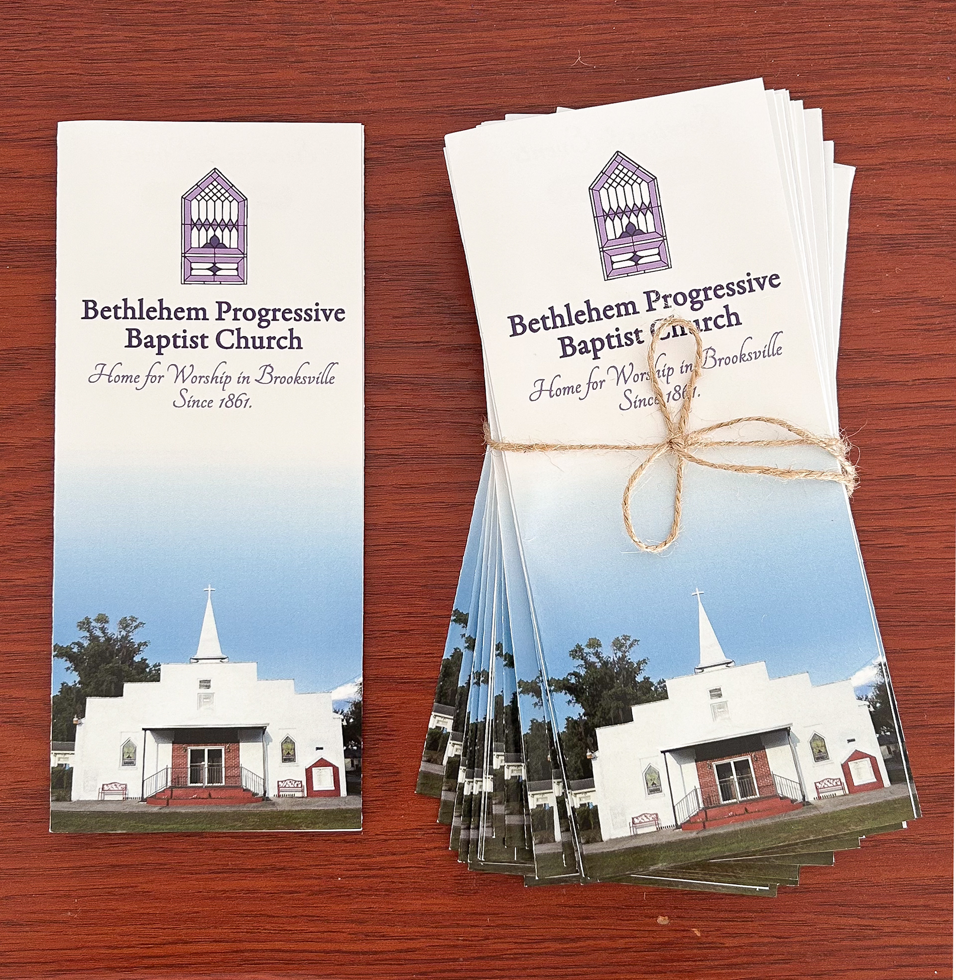
In addition to creating multiple logo concepts and branding directions, I designed several print materials for the church’s booth at a local community event, including a banner, trifold brochure, and double-sided tabletop flyer. The banner was designed with a bold purple-and-white color scheme to help the booth stand out from a distance and reinforce the branding at a glance.
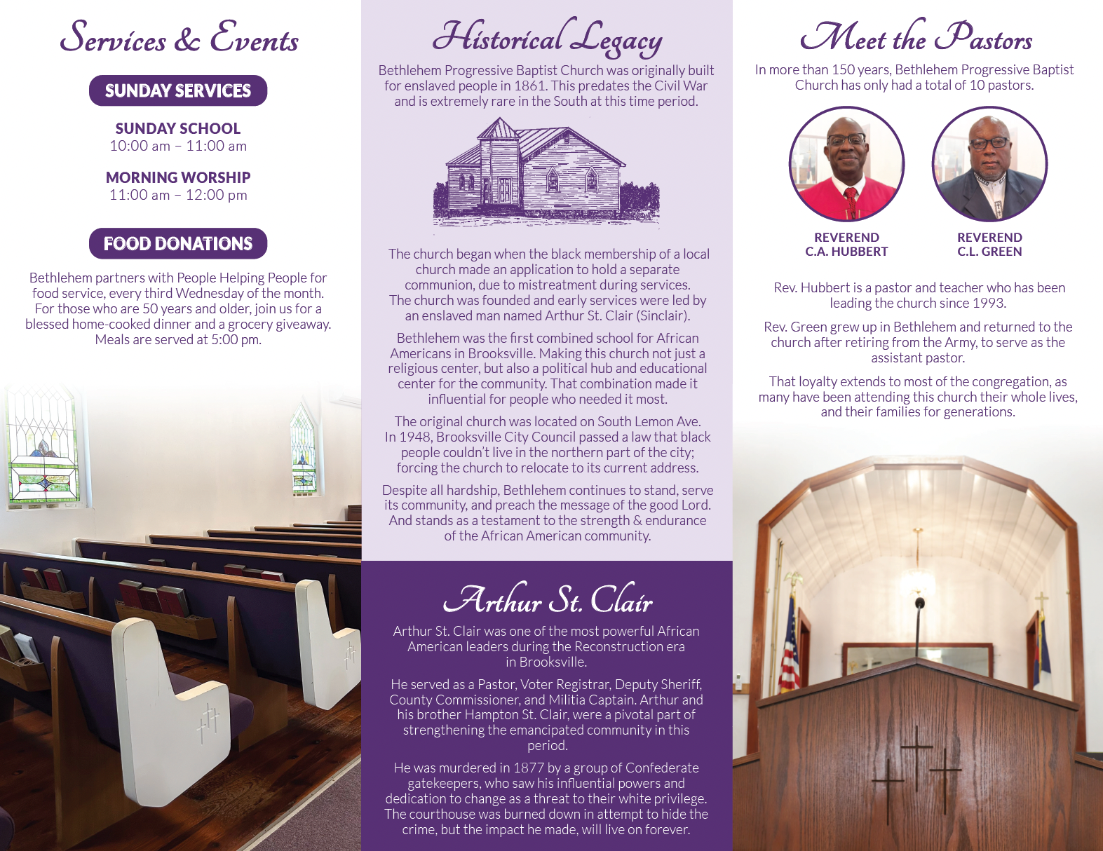
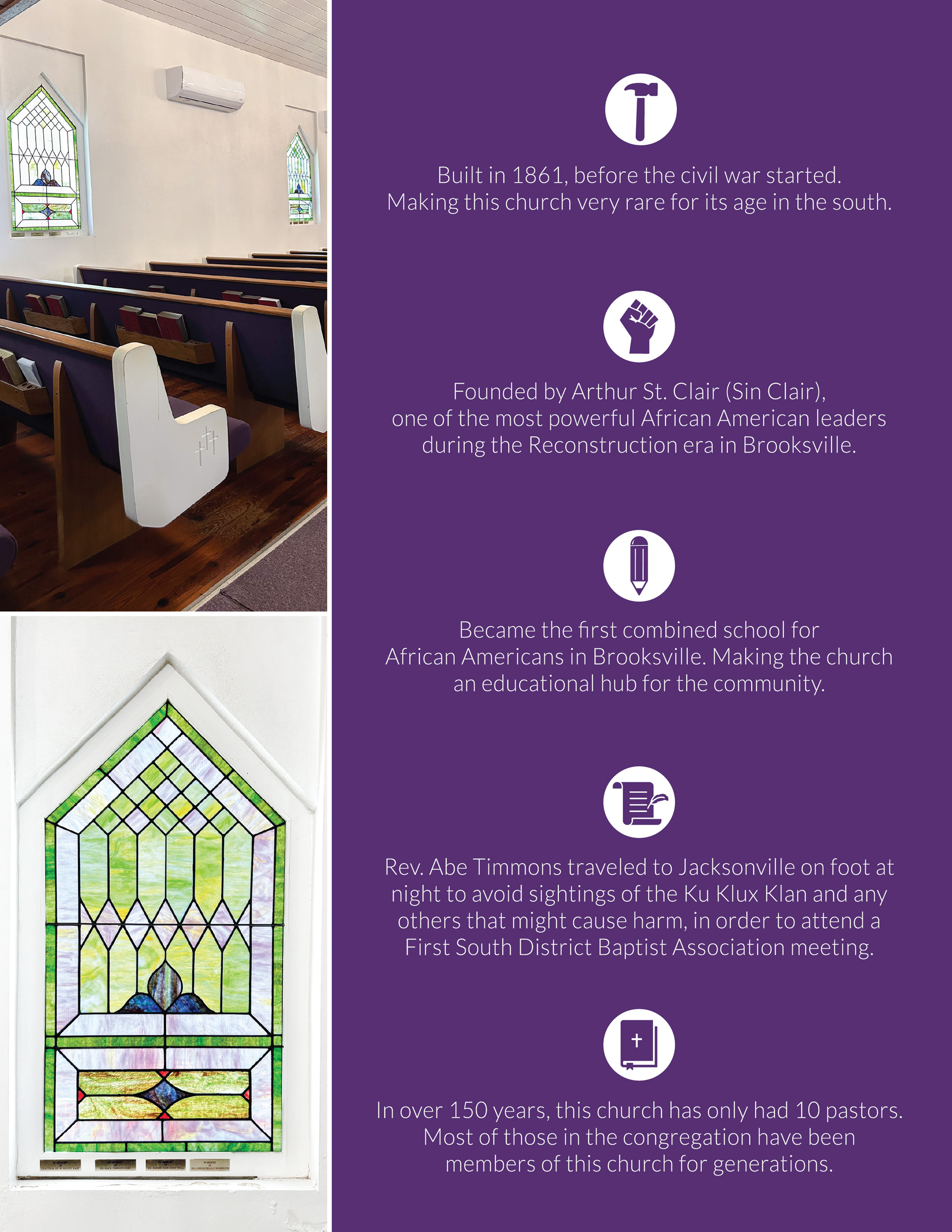
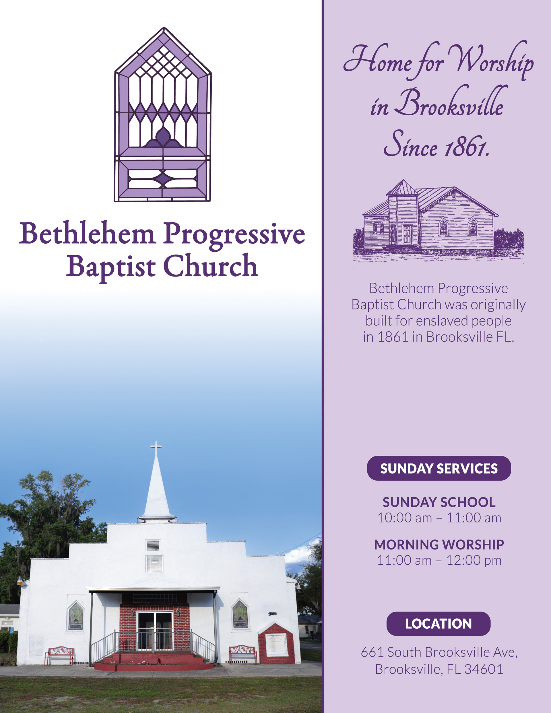
The tabletop flyer was designed to quickly communicate the church’s most important information in a visually accessible format, including service times, location details, photography of the church and interior, and key historical highlights. The trifold brochure was structured to balance readability with a large amount of historical content. The exterior panels and opening spread were intentionally kept clean and visually engaging to draw people in, while the interior panels organized more detailed information in a way that remained clear, legible, and easy to navigate.
Overall, the project helped the church establish a cohesive visual identity while effectively promoting its historical legacy within the community.