PROJECT details
Project Type: Logo & Branding Creation
Company: MindSpring Academy
Date: 04/2025
Role: Graphic Designer
Project Duration: 2–3 Weeks (Design Time)
Intended Use: Establishing Brand Identity Across Marketing Materials
PROJECT OVERVIEW
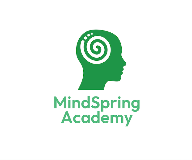
MindSpring Academy, an innovative online learning platform, wanted a clean, modern brand identity that reflected their mission of continuous growth and accessible education. I started with finalizing a custom logo design that helps visually communicate the company's services and mission. I also helped develop a comprehensive branding pack that included a cohesive color palette, textured gradients, and versatile design elements that aligned with their core values of flow, growth, and clarity. The greens and white branding colors establish the feeling of growth, and tranquility while also keeping a modern, fresh tone.
The use of dark green and light green tones was intentional to evoke a sense of trust and intelligence, while keeping a very modern and clean-looking appearance. The swirling form symbolized both the energy of a natural spring and the concept of personal growth. Three dots were incorporated to further the idea of continuity and add a distinctive touch to the minimalist design, making the logo more memorable.
With smooth curves and simplified forms, the visuals are instantly recognizable and
scalable across digital and print formats.
The final imagery holds the company's desired balance for a design and branding that invokes something between professional and approachable.
Project Type: Logo & Branding Creation
Company: MindSpring Academy
Date: 04/2025
Role: Graphic Designer
Project Duration: 2–3 Weeks (Design Time)
Intended Use: Establishing Brand Identity Across Marketing Materials
PROJECT OVERVIEW
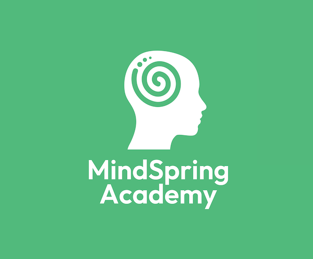
MindSpring Academy, an innovative online learning platform, wanted a clean, modern brand identity that reflected their mission of continuous growth and accessible education. I started with finalizing a custom logo design that helps visually communicate the company's services and mission. I also helped develop a comprehensive branding pack that included a cohesive color palette, textured gradients, and versatile design elements that aligned with their core values of flow, growth, and clarity. The greens and white branding colors establish the feeling of growth, and tranquility while also keeping a modern, fresh tone.
The use of dark green and light green tones was intentional to evoke a sense of trust and intelligence, while keeping a very modern and clean-looking appearance. The swirling form symbolized both the energy of a natural spring and the concept of personal growth. Three dots were incorporated to further the idea of continuity and add a distinctive touch to the minimalist design, making the logo more memorable.
With smooth curves and simplified forms, the visuals are instantly recognizable and
scalable across digital and print formats.
The final imagery holds the company's desired balance for a design and branding that invokes something between professional and approachable.